The Definite ANTLR 4 Referece: A rant about today’s book quality
An Amazon review gone wrong
Recently, I wrote an Amazon review of a book. To be precise, I made it about the book itself and not its content. To be even more accurate, it is not an Amazon review because Amazon denied publishing it although I merely stated the facts.
The book I am talking about is the The Definite ANTLR 4 Reference by Terence Parr. I knew that the contents of the book would meet my expectations because I had already purchased the e-book version for my Kindle. Nevertheless, I like having a book that you can skim through. More important to me was that I wanted to support the author who made the complete ANTLR framework open-source. I highly appreciate this, and it is my way of saying “Thank you. Great job!” Therefore, before you jump to any conclusions: The following is only about one sad example of today’s paperback printing quality.
The publisher of this book is The Pragmatic Bookshelf and honestly, I am not sure if they are to blame or if the printing was outsourced and it was just bad luck. I am used to the fact that nowadays, no one bothers anymore to sell books that you love to hold in your hands. In general, I am OK with this because a reference to a parser generator will have a different life-span than a high-quality hardcover of “The Lord of the Rings.”
However, while I support using eco-friendly paper, the printing quality of text and gray diagrams can be kept high without much further impact on the environment. However, when my ANTLR 4 Reference arrived, I was speechless about the lousy printing. As a researcher who works in image processing, I am probably overly picky about this, but I try to show why I believe that such quality is not acceptable.
Taking a closer look on 3 different books
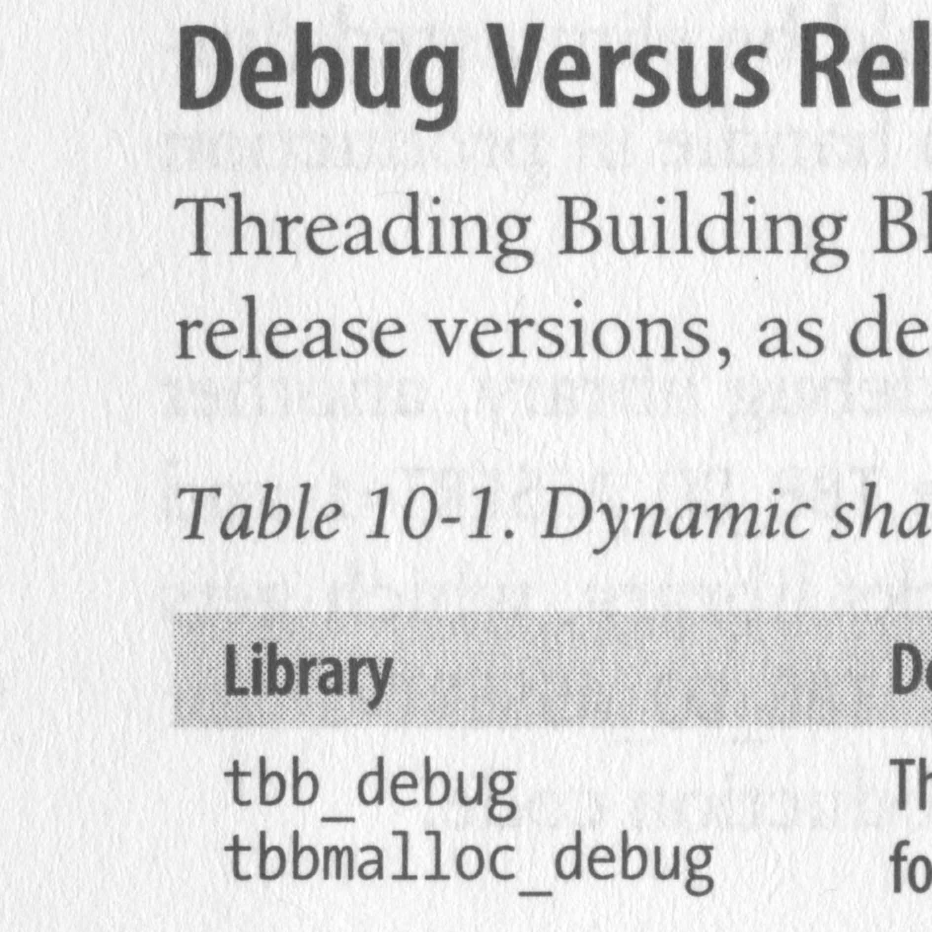
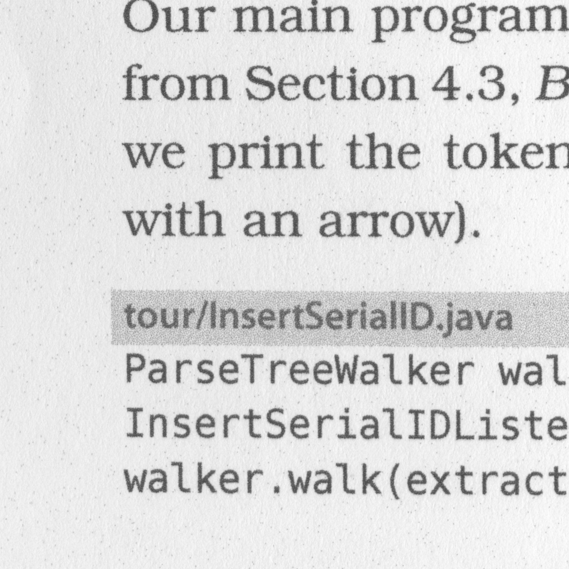
I took two additional books from my shelf and made gray-scale scans of a 4x4 cm area at a resolution of 1200dpi. I did not use any further jpeg compression, no filters, and the scaling for the website was done without interpolation. All three books are paperbacks and they have (at least had) about the same prize and are of the same kind: developer literature. While Power Programming with Mathematica was published in 1996, the Intel Threading Building Blocks was published in 2007. My version of the ANTLR Reference is from 2014, but if indeed print-on-demand was used, then the printing dates probably to 2017. In any case, we have more or less ten years between each book.
You can look a the original scans of the pages here:
- David B. Wagner. 1996. Power Programming with Mathematica: The Kernel. McGraw-Hill Original Scan
- James Reinders. 2007. Intel Threading Building Blocks: Outfitting C++ for Multi-core Processor Parallelism (1st Edition), O’Railly Media Inc. Original Scan
- Terence Parr. 2013. The Definitive ANTLR 4 Reference (2nd ed.). Pragmatic Bookshelf. Original Scan
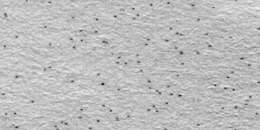
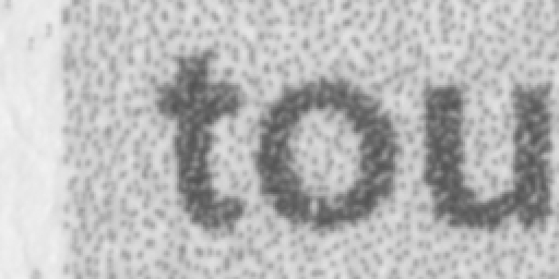
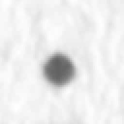
When I opened my brand-new copy of the ANTLR 4 Reference, the first thing I noticed was that there were black dots all over every single page. I know that most, if not all, color laser printers include barely visible dots on each printed page that contain tracking information. This is referred to as printer steganography, but usually, it is not directly visible and I am not even sure it is what I see in the ANTLR book. However, on its pages, dots are visible with bare eyes from a distance of about 30 cm. You can spot them on the original scan easily and here, I have made them more visible by adapting the histogram a bit
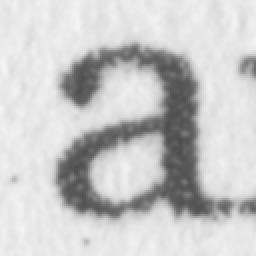
The next thing I noticed was that the font does not look sharp. I could not pin-point it down at first because I was not sure if I got distracted by the annoying dots or if there was something else. On a closer look, it almost seemed as if the black text was not quite black. When we compare the high-resolution scans, however, it becomes clear that this is an artifact of the printing. For comparison, see here a close-up on the letter “a” in the Mathematica and the Intel TBB book
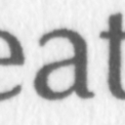

Compare this to an “a” from the ANTLR 4 Reference
That reminded me of the good old days of matrix printers. What bothers me the most is that even my Epson laser printer has a better printing quality. Unfortunately, text boxes with gray highlighting look even worse in the ANTLR Reference. I tried to pick something similar from the other books where gray areas needed to be filled. From the Mathematica book, I took the icon and enlarged it

From the TBB book, I chose the gray text box.

This looks pretty solid to me. In the ANTLR book, however, the bad character printing is now combined with bad dithering of the gray areas.
Finally, I picked a simple period as the purest text component and compared them. Since we have here an enlargement of 4x, we get an even closer look. In both of the older books, the periods are printed well as round disk
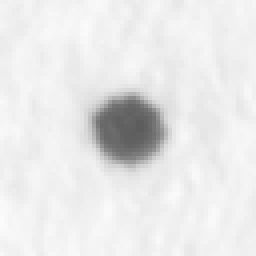
This is how the period shows on the ANTLR page.
The difference in quality is evident. I could point out that my copy of the book also contains these white lines that you get when you run out of toner, but I hope I already made my point clear and I spare you another scanned image. For someone who likes books, it is just disappointing to have to look at such a poor copy when each local printing shop could have done a better job. When I read, then I am connecting this with sitting comfortably beside the fireplace and enjoying the evening and then, I want to enjoy the book as a whole; not only its contents.
Conclusion
For the sake of argument, let us see if the bad printing quality is somehow connected to the prize. First, the Intel Threading Building Blocks, which has 30 additional pages is currently available for almost the same prize as the ANTLR reference and we already saw that it has a better quality. Going one step further, we could dare a comparison with the Art of Computer Programming, which I consider of high quality. It is a hardcover with a nice feel and excellent printing.
I bought my ANTLR copy for 25 Euro and got a paperback with 300 pages. The complete box of TAOCP with all four volumes is at the moment available for 160 Euro. This makes 40 Euro for one book of about 600 pages. Even if we ignore the incredible value of one single page of Knuth’s work, we are left with a price difference of 2 Cent per page in favor of TAOCP.
How it is possible to pay 2 Cent per page more and end up with a book of such unsatisfactory quality is beyond my understanding. To explain this, we surely need an expert from the publishing company. Since scientific publishers already convince us for years that we need to pay for publishing an article just to pay again when we want to read them, I’m sure there is a sound reason for the 2 Cent as well.
To end this discussion, I dearly hope, that my copy is an exception. Even if not, I at least hope that Terence gets a large share since this was my intention from the start.